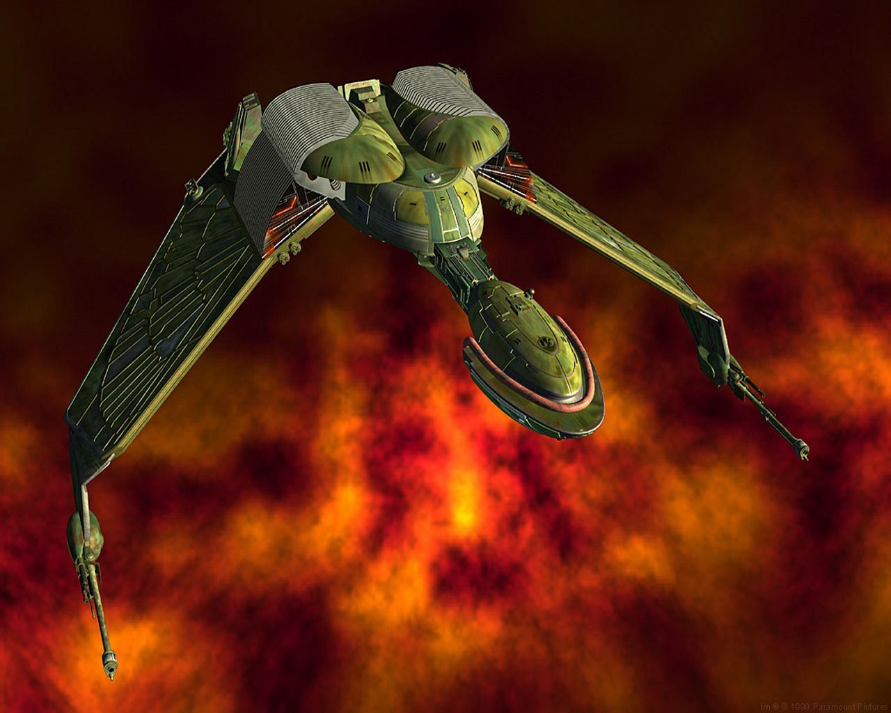
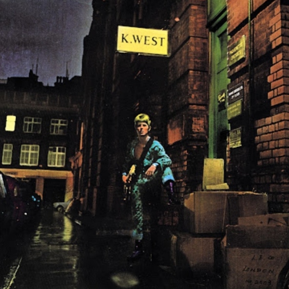
A picture of Lara Croft in new Tomb Raider hand in hand with Lara Croft from the old Tomb raider Series. The new one labeled GNOME and the old one KDE.
And other memes made by people who have never used KDE.
Gnome and KDE are equally good.
Imo they are both solid technologically, but KDE delivers much more with it’s defaults. Obviously you can theme both to hell and back and make them look however you want and get whatever functionality you want, but default KDE is so much more usable than default gnome it’s not even a competition.
deleted by creator
Is it? Gnome loads in a ton of services and feels pretty bloated to me. I don’t notice that it’s any lighter than KDE, and it often feels more sluggish.
But, they’re both desktops and are loading in a bunch of stuff whether you use it or not, so you’re right that they’re pretty comparable.
Bro offered a truce, why not take it?
Plasma and GNOME both have legitimate uses, no one is objectively better than the other.
First, I wasn’t the person “bro” responded to.
Second, they said Gnome works fine and KDE is bloated by default, implying Gnome isn’t bloated. Which it certainly is, which I said.
A person can’t just say, “you’re ugly as fuck, but let’s just agree to disagree” and have it be a truce.
deleted by creator
That would be way more accurate with KDE on the left and XFCE on the right. GNOME is completely different (and also, hands down, very ugly) out of the box.
Have you ever used either?
To say they’re reversed is pushing it as I’m not sure gnome is at the level of the low poly lara yet
I used Gnome for years and can honestly say that if you put a lot of effort into it, mess with configs, and install a few extras, it rises to a new level of kind of shitty but usable.
Fuck, KDE was pretty a decade ago, and Gnome is still just plugging away, being the bare minimum.
I honestly don’t really see it, I think vanilla GNOME looks amazing, while KDE Plasma just screams Windows 7 to me.
Having said it that, both are great DE’s with vastly different approaches. So these can definitely just co exist, while we can both agree that both DE’s are great for different people and workflows.
One thing I’ll give gnome, it’s really good for 2-in-1s. The desktop metaphor works really well for tablet and trackpad use out of the box.
i think is reversed… but it’s ok
deleted by creator
I like the template but the KDE GUI is simply beautiful, and looks very modern, so this is not really a real thing
Everyone here is super salty, meanwhile I just thought this was suggesting that GNOME is like a rounder KDE
Used both. Dislike both. Now on i3.
Same, but I ended on Hyprland
Used i3 for years, tried bspwm. Liked the concept - absolutely loathed the community. Ended on herbstluftwm.
If Wayland ever fixes hdpi scaling, I’ll be looking for something that works the same way: configuration is entirely through scripting, not config files. I don’t think I’ll ever give that up, now that I’ve discovered it.
It looks like hyprland uses config files, right?
Arch btw?
EndeavourOS, formerly pure Arch btw.
Pure terminal, GUI is for noobs 🤣
Ill choose those triangle titties anytime
XFCE just chillin in the background
The idea that kde looks bad is laughable… Kde user here lol.
You get a like for the meme from me, but I can’t see how this is remotely true… KDE user here… KDE user for a reason…
Wat? Not sure what is the creator smoking buthe/she should seek help.
KDE feels like Windows to me. GNOME is something entirely different, it’s UI is very touch friendly, only downside is it has old code all over the place.
Out of the box, maybe, but kde is super customizable to be how you want it. I think gnome can do that too, but it feels much more opinionated and all I ready about is install scripts that break. (I haven’t tried gnome in years though)
Yep, I love how quickly I can turn a new install into a fugly mess with no way back to sanity
For me GNOME feels like MacOS
You can customise KDE plasma a lot. I think you can do that with gnome as well but it’s harder as far as I know.
As a KDE guy, indeed gnome is much more polished when it comes to gestures.
Problem is, I’m also much more of a keyboard guy, and use my laptop mostly docked and with external keyboard/mouse/monitor.
Touchpad is out of reach most of the time, so I don’t really care about gestures.


