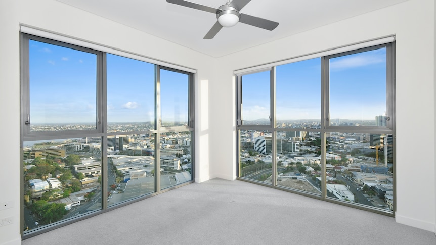
People started decorating their homes based on a perceived resale value rather than what they wanted to live in.
Same reason cars are mostly white/silver/black.
Depending on where you live the white and silver is actually popular because it helps keep it a bit cooler.
So would yellow and other light colors that aren’t available from the manufacturer.
I lived above a busy road earlier this year. I realized that 95% of cars are either blue, red, or some shade of gray (including white and black). It was a real treat when a yellow, purple, or olive car came along.
We almost didn’t buy our current house because it was all grey. Then I promised my wife we could repaint before moving in and now it is fine (the location was perfect for us, so we had to overlook some other flaws)
Ha! I just exposed a brick wall in my house, what do I win?
20L of italian white paint
Choice of cotton, sea salt, moon white, morning white.
Lexicon the world
I’m going to go against the grain here a little bit. A neutral background and style in your home can be a good backdrop that will accentuate any features that you might add that are more eccentric ( i.e. wall art or accessories like a lamp).
And the cheap unnatural shades of yellow and green give me depression and exhaust my eyes (I have ADHD which might contribute).
Same, at least one of my walls is just a giant TV.
This is the best summary I could come up with:
Long gone are the days of exposed brick or 90s feature walls; instead, domestic interiors have succumbed to subtle shades of white, grey and beige — or their cursed cousin: greige.
has trickled down; rental properties today sport poorly painted walls in neutral shades and a limited choice between cheap carpet, laminate and fake timber flooring — aka the “landlord special”.
Whether it’s the beige and black cashmere turtlenecks of stealth wealth (think Gwyneth Paltrow’s trial looks, Succession’s Roy family and Lydia Tár) that we’re lusting after or the elevated sportswear of COVID normcore that we’re living with, there’s a stultifying lack of colour.
“The grey walls and these [box-like spaces] in real estate listings enable the virtual furniture to look more natural, and create an uncanny valley effect that is ripe for digital augmentation,” explains Wagner.
It first took purchase in the post-recession trends of minimalism and farmhouse modernism — but at this point, Wagner says, the dominance of greige has little to do with personal taste; rather, it is a result of “the commodification of the house and of the home itself”.
Sue Fenton, an interior designer at global architecture firm Woods Bagot and PhD candidate at RMIT University, says she’s noticed our built environments become increasingly less distinct in Australia.
I’m a bot and I’m open source!
I actually prefer the light grey walls, I have lots of smart lights that mean I can bounce light off them and give rooms whatever mood I want anytime I want. The walls are just the canvas now. Don’t underestimate an rgb light pointed at a wall to make things really colorful without being overly bright, and nowadays relatively privacy-friendly Bluetooth lights are available down at hardware stores for cheap.
Bland? Maybe. But it looks neat, tidy and breezy. We went an almost blue shade of white and tbh we love it. Combine it with almost sandy looking floors and dark carpets and it looks modern, and yet relaxing.
I am super partial to an exposed brick wall though! Love a bit of 90’s style but that’d look shit in my 2010s style cheap cookie cutter build.
“the commodification of the house and of the home itself”. ** G R O S S**
I don’t get this. It’s your house, furnish and paint it however you like instead of complaining


