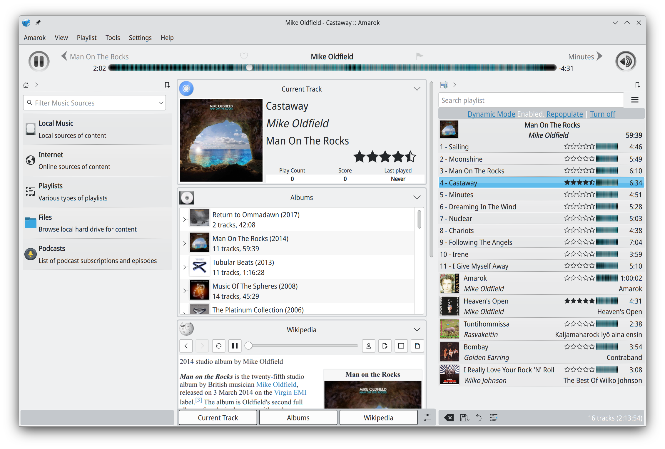
What, the grey bars? Crappy is a rude way of putting it, but yes they looks pretty bad. I think that’s probably an artifact from the Qt4 days. It looked fine with Oxygen. Rest looks fine to me. If you think it looks busy, well the screenshot has a lot of panels enabled, just to showcase the features. IIRC many of them are not shown by default and a user would only keep the ones they need, since the interface is customizable.
I’m not trying to be “rude.” But the line height, weird font sizes, spacing between elements. Just everything about it screams function over form. There is a way to have both. Most software that adheres to modern design principles have overcome the “janky” UI
@tsonfeir@leopold I think they’re more focused on fixing build errors and putting out a release for now, and leave UI updates for later. So we’re stuck with the old look for this release.


What, the grey bars? Crappy is a rude way of putting it, but yes they looks pretty bad. I think that’s probably an artifact from the Qt4 days. It looked fine with Oxygen. Rest looks fine to me. If you think it looks busy, well the screenshot has a lot of panels enabled, just to showcase the features. IIRC many of them are not shown by default and a user would only keep the ones they need, since the interface is customizable.
I’m not trying to be “rude.” But the line height, weird font sizes, spacing between elements. Just everything about it screams function over form. There is a way to have both. Most software that adheres to modern design principles have overcome the “janky” UI
@tsonfeir @leopold I think they’re more focused on fixing build errors and putting out a release for now, and leave UI updates for later. So we’re stuck with the old look for this release.