
You know the worst part about flat design? Fucking “hamburger menu”. Fuck that shit.
The second worst part? “Text? Lol get real, old man!” Menus that don’t have text so I have to guess what the fucking icons mean on every different app/site.
Ditto on the no text part. That is an accessibility failure that’s way too widespread.
Sometimes I’m afraid to even push a button: does this delete my thing, or does it do some other irreversible change? Will I be able to tell what it did? Maybe it does something completely different, or maybe I’m lucky and it does in fact perform the action I’m looking for and which in my mind is a no-brainer to include?And it’s infected interpersonal communication too - people peppering their messages with emojis, even professional communications. It not only looks goofy, but is either redundant (when people just add the emoji together with the word it’s meant to represent - such a bizarre practice) or, worse, ambiguous when the pictogram replaces the word and the recipient(s) can’t make out what it depicts.
The most fun is when it’s a mix - the message contains some emojis with accompanying translation, some without.Fontawesome and its consequences have been a disaster for web development.
augh jazz cup my beloved. I wish we had loud baggy pants like that again.
I just bought myself a pair of parachute pants! They’re not nearly as loud as the wind breaker suits of the 90s and early 00s, but I love them.
90s because they used logic in designing things. Now they change for the sake of change.
Like how there was a damn good reason for the start menu button to be on the button right: you could fling your mouse the lower left and no matter if you did it too far or fast, it would always hit the corner, and be at the start button. You never had to “target” the start button, you simply went all the way down to the left. Didn’t even have to look.
So obviously, they must of had an idea equally smart, thoughtful reason to put it in the middle, right? That’s a decision born from utility, not aesthetics. Clearly not making a painfully obvious attempt at copying their main competitor.
What on earth are you talking about? What start button is in the middle?
Windows 11 Windows button is now in the middle of the taskbar, as opposed to where it’s been for literally 30 years.
Although you can change it to be bottom left again. But it should be the default.
I think this is about windows 11 and Microsoft’s stupid decision to move the start menu to the middle
Y2K would like to have a word…
Y2K was fine. We fixed it in the '90s, it employed practically the entire tech workforce for all of '98 and '99. It made it so easy to get into that industry for people like me
The music. The early 90s saw the rise of independent record labels which then gave rise to bands who wouldn’t have stood a chance otherwise, aka Indie Music. After the 60s, the 90s is by far the best era for modern music ever.
Frutiger Aero was when design peaked
I’d say PS2 belongs in flat design, even if it falls outside the dates they think: its design language was ahead of its time
And the PS5 isn’t really flat design, especially compared to the current Xbox.
Frutiger Aero was best. Not only for beautiful design, but also there were standards people followed on making UI’s. Now everything goes. Last time I wanted to register on some shitty website it didn’t provide me any feedback that I wrote “weak” password (I copied it from KeePass), except literally green button that you could click like a madman and it didn’t do anything but went gray when password was “strong enough”.
Flat design is clinical depression in graphical form, a reflection of the contemporary existential/mental health crisis. It’s a societal cry for help, basically.
Or smartphones and high pixel density displays became the norm, and raster graphics don’t look good or scale well on them. Simple vector graphics are crisper on your screen, can be rendered via things like CSS, and can more easily scale to different resolutions and dimensions.
Apple’s skeuomorphic phase overlapped the Retina display era, though, so I don’t buy that explanation. Also, it’s nothing to do with raster vs. vector. The photos that we take with phone cameras are raster graphics, for example. They look great, and it’s because they’re high-resolution. High-res raster UI elements would look great, except then the versatile manipulation by CSS would not be possible. Vector graphics are very good at that.
But here’s the thing: Complex vector graphics exist, too. There were some pretty fancy PostScript graphics even back in the early 1990’s. With all the pixels that we have now, we could have good design instead of flat, if the developers bothered. But it seems we’ve internalized the feeling that we’re not worth the effort, aesthetics and color aren’t interesting, and life is a joyless slog. Which sounds and awful lot like clinical depression…
(Incidentally, odd that emoji aren’t flat design.)
(Incidentally, odd that emoji aren’t flat design.)
That actually depends on browser, app or OS that’s doing the render. Apple and Whatsapp use the same design, Android uses a slightly different one, Discord and Microsoft both use flat designs, but for Win11 it’s a different set
Interesting! I see what you mean, but while looking up Win11 emoji, I found this article from Microsoft about adding 3D design elements based on customer feedback. And, indeed, on my work computer (23H2), they’re not-quite-flat anymore.
I’m ready for post-flat design.
I’d be so happy for a desktop window manager that didn’t make all of the window borders grey-on-grey, and distinguish the active window by making the title text slightly-darker grey.
Seems more a rejects of the flamboyance of the prior two generation which will certainly give it a different feel. It absolutely felt fresh at the time of inception.
Memphis design for the colors and patterns, Y2K for the colorful translucent electronics, and Frutiger Aero for the GUIs.
deleted by creator
I miss hip hop
It’s about 30% of what I listen to. A lot of ATCQ, Digable Planets, Wu-Tang Clan and such.
Twinz by Fat Joe and Big Pun is almost on repeat for me, as well.
90s, BeOS
Far and away the 90s and it’s not even close.
Then the 80s show up and takes your lunch money, by blinding you with our awesome fluorescent clothing
Ha!
Amazing time for music as well.
and real original movies. and tv shows with writing. and music videos. and exciting new progress in video games. and cheap love music. and thongs under low rise jeans.
Give me the 90s with today’s safety standards (for things like car/aircraft/etc)
Don’t forget about the banning of indoor smoking in public places. God the 90’s were a horrible time for that although it was winding down.
It wasn’t so great if you were gay, either. Racism was mostly passe, but everyone thought Columbus was a cool guy and the natives disappeared on their own, which is not ideal.
Not being poor and the blissful delusion that history is over sound lit, but there are some hard edges to the era I hear about occasionally, as a Zoomer. And WTF is up with that song about rubbing your boner on people?
I was fortunate to have grown up in the pacific northwest where being gay was mostly fine, racism was mostly absent and we learned about smallpox blankets in school.
Dope. I grew up in a rural area where even in the 2000’s homophobia lingered pretty good. I could be wrong about Columbus in the 90s, I guess, but he was definitely a hero at some point.
I grew up pretty rural as well but in a very liberal state and since course standards were set at the state government level, the education definitely leaned that way. I think Columbus is still celebrated in certain parts of this country where they refuse to acknowledge indigenous people’s day.
Can I get a link to the dick-rubbing song?
It’s subtle, so really listen to the lyrics
Edit: Actually, think it’s too close
Yep, Too Close.
It was in Leave the World Behind, and if the characters weren’t taking it seriously I 100% would have thought it was a parody song.
I think they’re talking about the designs, not the whole decade.
It’s an interesting idea, though, that one’s preference for a particular design or aesthetic, especially when that design or aesthetic is emblematic of a particular historical or cultural moment, is never wholly isolated to its visual or material components, but also innately tied to our memory and understanding of that moment. I personally don’t think you can extricate a particular aesthetic from the psychic background noise surrounding it. Our minds don’t work that way. It’s always forming these subconscious or unconscious connections, binding events and memory to abstract signifiers.
We don’t like the 90s aesthetic because it’s “better” or even attractive. I mean, nobody has wallpaper in their home with those pastel and neon triangles. Many of us like it because it reminds us of childhood, of not having responsibilities other than waking up early enough on Saturday to catch all your cartoons and of not complaining too much when you have to go visit your grandparents who can never remember your birthday and who always ask you how old you are this year, of finishing Super Mario on the SNES before your friend does so you can brag about being better at video games than him. It’s of a simpler time and place, because we were simpler. And it was, in retrospect, of an America briefly sandwiched between the end of the original “Forever War” that was the Cold War, and the beginning of the 20th Century’s new “Forever War,” that is the War on Terror.
But did I miss that by a mile.
Yeah but you’re right.
You’re still right. You forgot just deciding to rent a place out downtown with your girlfriend on a whim. How life is supposed to be.
Frutiger Aero is my favourite.
Memphis design will always win my vote. The weird ass electronics, the ground breaking UI components, just absolutely nutty decisions and insane product concepts built on everyone’s wild dreams of the future. I even think the same forward looking design concepts carried into the Y2K designs— particularly with personal electronics like phones.
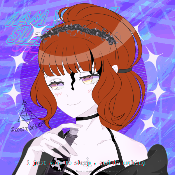
Hey that’s a nice ilustration!


