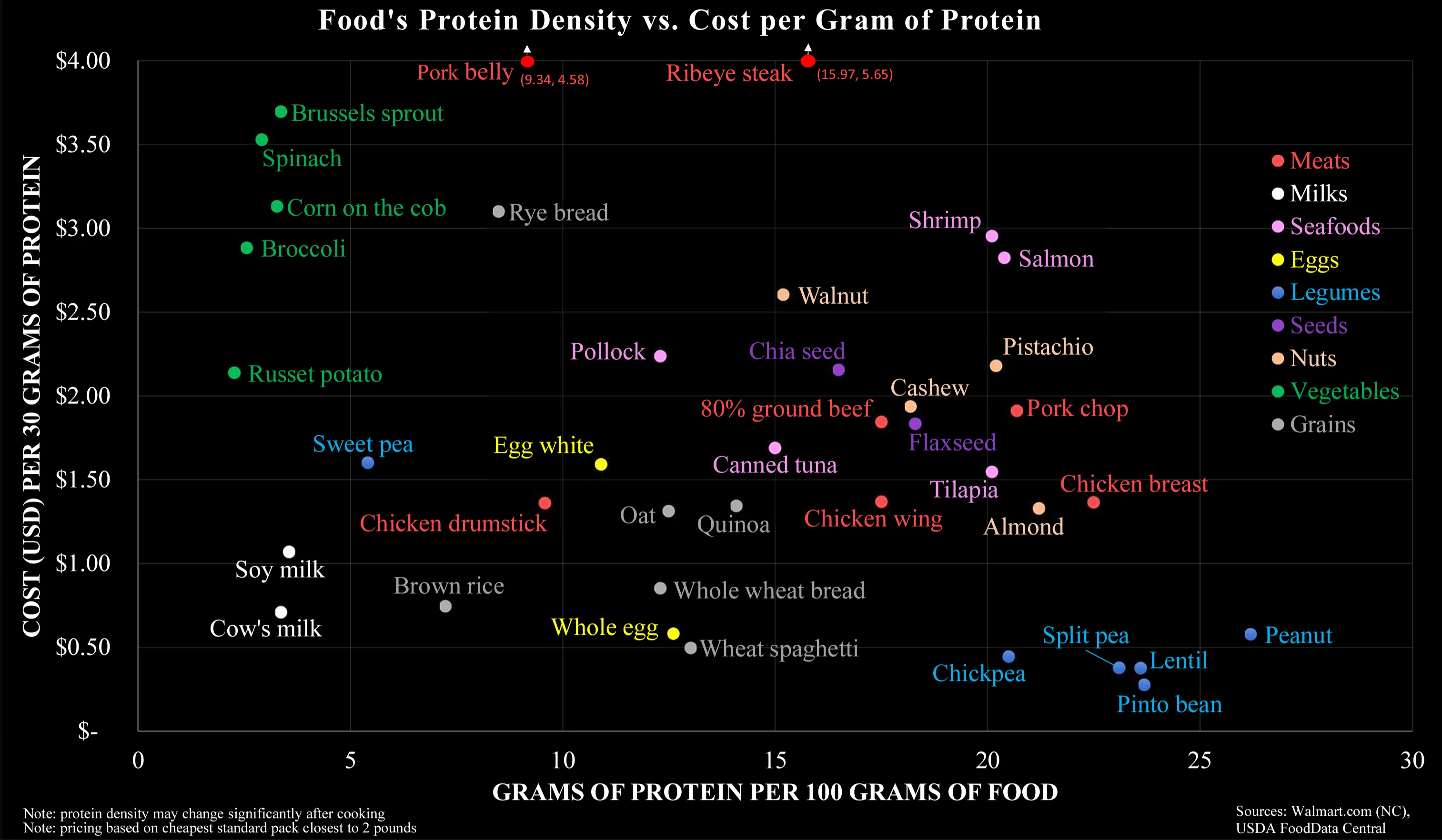
The graph displays protein per unit weight on the Y axis, but protein per 100g on the X axis.
Pork Chops are at a similar X location to Chicken breast, but chicken breast is lower on the Y axis, that means that the chicken should be cheaper. It isn’t though.
The dead giveaway that this is going to be wrong is that it’s in USD, which doesn’t apply to Canada since we have supply management on poultry here.

This graph displays cost based on grams of protein per unit weight, not based on weight alone. You’re comparing items based on weight alone.
The graph displays protein per unit weight on the Y axis, but protein per 100g on the X axis.
Pork Chops are at a similar X location to Chicken breast, but chicken breast is lower on the Y axis, that means that the chicken should be cheaper. It isn’t though.
The dead giveaway that this is going to be wrong is that it’s in USD, which doesn’t apply to Canada since we have supply management on poultry here.