- cross-posted to:
- android@chat.maiion.com
- cross-posted to:
- android@chat.maiion.com
I hate being a doomer, and this does look great… But doesn’t Google own Fitbit now? And hasn’t material you been out for almost 2 years now?
Back in my day, Google apps were often among the worst offenders when it came to not following their own design philosophy!
Google has no idea what to do and how to make it happen.
Seems a waste of time and resources. We all know that google is going to kill this and merge it with google fit. So, start adding features to google fit, so when the time is come, it’s a suitable replacement. Please don’t do like usually, the replacement is not ready or has nowhere the same features
I thought it was the opposite? Google Fit is practically abandoned on WearOS in favor of the Pixel Watch’s Fitbit integration.
ah right i forgot how google operates.
First they abandon their perfectly good app.
Then they focus their attention on the new shiny toy
Finally, they kill the old one and rebrand the new with a new name that leave everyone confused.
One week ago my grandma called me to ask “where’s that Duo icon that you told me for do video call to cousin?” I was blindsided as i uninstalled it years ago. It was renamed to google meet, but old google meet was killed. Or something like that.
I thought one of the terms of the Fitbit deal with the competition ombudsman was that they had to keep it separate from fit. What makes you think they’re going to join them?
usually google doesn’t like redundant stuff
More likely to kill Fit then.
unfortunately. Fit is such a nice clean app, it’ll be a shame when it is killed
deleted by creator
Looks fantastic. Nice and clean.
I don’t have a watch or a Fitbit, but these screens sure look a lot like Google Fit.
Wow, looks great!
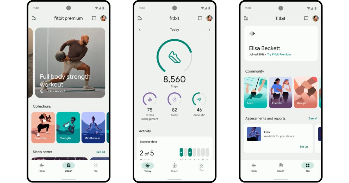
I’m holding it up against the current app and it does look way better, but the changes are less drastic than expected.
Most of the change comes from going from 4 options to 3. It happens on the bottom tab bar, and on the small trackers below the main one on the today tab. They also add some more whitespace around those trackers, boost their size, and add more separation between the next section.
It’s subtle, but it’s honestly a huge improvement in cognitive load. The first time I opened the Fitbit app on my new phone I closed it because it felt overwhelming and cluttered, this feels a lot more focused.
That being said, still really irritated that basic watch and health tracking is locked behind Fitbit Premium, and given that it’s Google, it’ll probably be cancelled with no clear migration options in a year or two.
What about dark mode? To me that should be the priority.
Edit: I just noticed that on the new version we will no longer be able to see the sleep stages without premium.
Fitbit/Google is again restricting data behind a subscription, I will move on to Garmin when the update is mandatory.
on the other hand, if you use health connect you can export all of that juicy good data to something else that actually lets you view it
What something would that be?
Google Fit, ironically


