

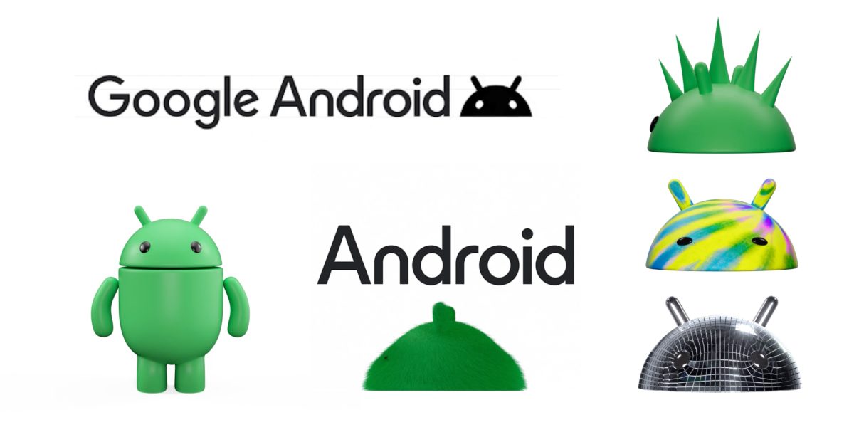
Following our previous report, Google is officially unveiling a new 3D logo for Android. The broad goal of this updated branding is to “help connect Android to Google,” and it follows the previous modernization in 2019.
Hey finally a change to the boring minimalist 1 colour 2d logos every company has these days! Back to the good old days!
We’re going full circle
Don’t really care how the Android logo looks, I just wish Google would fix the ridiculously oversized quick toggles and unnecessary whitespace they added in Android 12.
Oh, and the nesting of mobile data/WiFi toggles under another layer.
Logos are supposed to be easily reproducible at any size. This is a terrible idea.
I wonder if pseudo-3D app icons will come back.

Android for kids
I thought enshittyfication was about paying more for less, not terrible logos.
I like the old design more because it felt a bit more playful, with the lowercase a and simple droid being welcoming and not way too professional. This makes it really generic and brand-y.
When will companies learn that taking a 2D thing and making it 3D does not automatically make it look better?
sad WordArt noises
But how will the new middle executive justify their promotion?
Oh wow that looks awful.