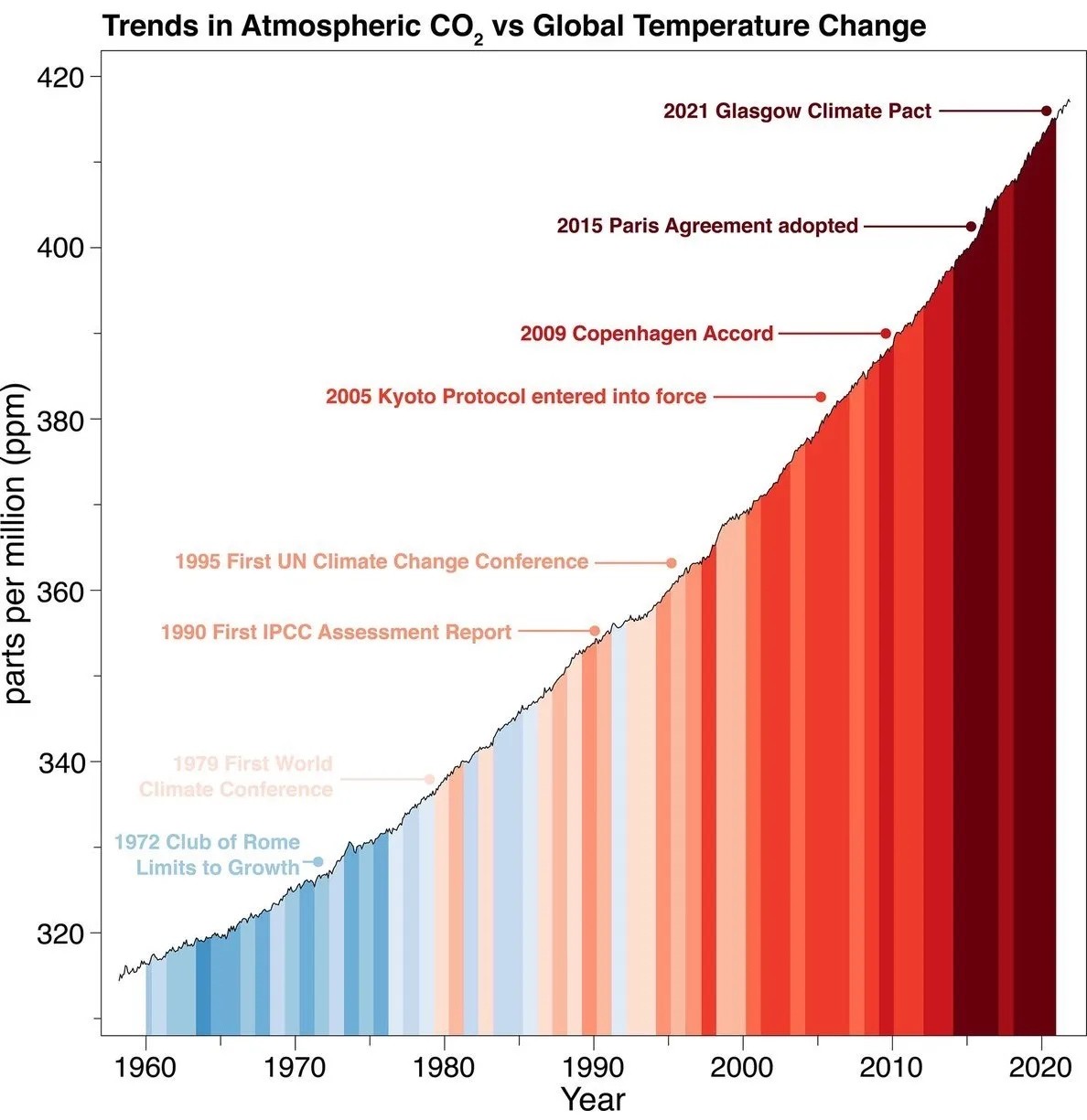
Of course selecting a range that shows the variation makes the variation more visible, but that doesn’t mean it’s exaggerated. There’s nothing about 0 making it the natural point of comparison - some CO2 in the atmosphere is normal. What is important is the shape of the slope - the continued linear growth.
The graph does not give us enough information to substantially interpret what an increase of 100 PPM CO2 in the atmosphere actually means in the greater scheme of things, but that’s hardly a fault of the graph - answering that would be a much bigger question. What it does show is that growth has not halted since the 1980s.
I guess it’s also worth mentioning that this doesn’t mean our efforts have come to naught - for all we know the growth would have been exponential, and we successfully made it merely linear. What’s safe to say based on the graph is, however, that what we have been doing is probably not enough.