- cross-posted to:
- linux@lemmy.world
- cross-posted to:
- linux@lemmy.world
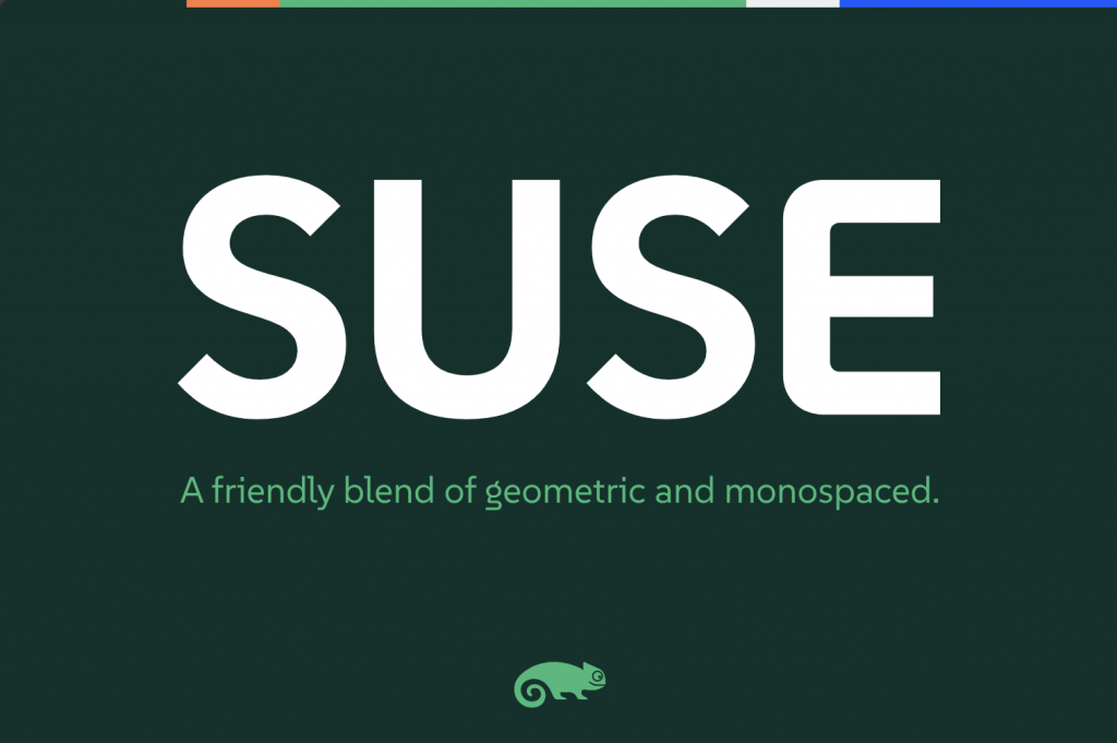
SUSE just open-sourced a typeface :)
You must log in or # to comment.
Already in the AUR as otf-suse and ttf-suse. :)
Silly question: what’s the difference between the otf and ttf fonts?
Edit: thanks for the explainers!
As far as I understand it, TTFs are more basic, while OTF can have more features and glyphs.
OTF is a modern extended version of TTF, with more features. Downsides are it can be bigger in filesize and could even take longer to load. But that is not really relevant for modern computing and one should default to OTF, unless there is a good reason to use TTF variant (if both are available).
Sounds like it, yeah.
https://en.wikipedia.org/wiki/TrueType
https://en.wikipedia.org/wiki/OpenType
Not a fan of semi-serif fonts, and not digging the rounded “corners” on E and L (while having sharp ones in lowercase L and lowercase i), but it seems it is trying to be highly readable so indeed it should be great for UI stuff. And doing a complete typeface covering such huge character map is no easy job.
no dotted zeroes = no terminal use
I don’t think this font was designed for the terminal. It’s a sans font with some inspiration from monospace styling, but with focus of brand recognition and usage in headlines or text. That’s what I’m getting here. Similar to what Ubuntu does with their font.
I don’t see a monospaced version anyway
I don’t understand how that hybrid is supposed to work. Monospace is a binary attribute; either all chars have the same width or not. So what is the font now?
It says that it s “inspired” by monospaced fonts. I imagine they mean stuff like the tiny serif on the lowercase
iThis
That’s a great question, on the face of it I can’t find very much info online. Wikipedia has an entry for monotype but not hybrid. The page ‘hybrid font’ does not exist. If anyone has more info please feel free to tag me, I’d love to know.
I like it. Not gonna nitpick. It’s nicer than those microsoft fonts that came out recently
I need more discussion on typefaces. Typography is one of my hyperfixations. :-)
P.S.: I meant “special interests”, not hyperfixations.
hyperfixations
You probably mean “special interest”. Simplifying, hyperfixation is such a strong fixation on something that you absolutely can’t think about anything else.
Based on what I’ve seen from this person, this is all I ever seen them talking about
Yeah, this is the correct term, thank you!
What is going on with that lowercase g?
That’s fairly standard for serif fonts like times new roman, baskerville, etc. Although it is uncommon in modern sans serif fonts and/or fonts designed to be viewed on a screen.
The Fira family has a similar fancy g for some reason
Here in Germany at least, if you read almost any printed novel, the type face will include this type of g. It’s so common, that I didn’t realise it’d be strange for some people.
(Although I do recall seeing a post about a kid that was confused by that weird letter, somewhere a while ago. Probably was still back on r*****)
Huh, just realized that the r-word and “Reddit” have the same number of characters.
Yeah it’s common. I’m not confused by it, just like a normal g more.
The commenter I responded to originally seemed confused/surprised by it, though.
I will give the font a try!
I’m not dyslexic, but I think legibility is super important and underrated on most distros. This one looks both aesthetic and very readable.
Do you know if it is already in the Fedora repos? If not, how can I install it?
Personally just grabbed it from their release page: https://github.com/SUSE/suse-font/releases/tag/v1.000. Then dropped those files into my ~/.fonts, directory.
This will be a nice addition to my collection of fonts :3
That’s awesome! Now how can I add it to Libreoffice?
Same as any other font. Add it to ~/.fonts or /usr/local/fonts. You might also have something like font browser already preinstalled, and usually there’s an Install button
Thank you! :D
Looks nice, but I will keep IBM Plex Mono.
But does it have unicode emojis?
😀 😁 😂 😃 😄 😅 😆 😇 😈 🕧 🕯️ 🕰️ 🕳️ 🕴️ 🕵️ 🕶️ 🕷️ 🕸️ 🕹️ 🕺 🖇️ 🖊️ 🖋️ 🖌️ 🖍️ 🖐️ 🖕 🖖 🖤 🖥️ 🖨️ 🖱️ 🖲️ 🖼️ 🗂️ 🗃️ 🗄️ 🗑️ 🗒️ 🗓️ 🗜️ 🗝️ 🗞️ 🗡️ 🗣️ 🗨️ 🗯️ 🗳️ 🗺️ 🗻 🗼 🗽 🗾 🗿
Hmm it specifically seems to be missing emojis
It’s a latin font.
Designing all unicode characters would be madness.
Thanks. I imagine most unicode characters and emojis are just copied over from some default font?
Maybe they’ll patch it into a https://www.nerdfonts.com
It’s a nice font. I just have a hard time with trusting SUSE after the SUSE vs OpenSUSE debacle.
i fw it
What does this means?
@P4ulin_Kbana @potentiallynotfelix fw = fuck with. It means they like it.
Thank you!
It looks gorgeous. Can’t wait to use it in my desktop.
Been using it myself since it launched, been loving it so far! Got it active on everything except my terminal.