Wow, they really took their logo from sexy, fast and expensive looking, to looking like an over priced soft drink?
That’s impressive, haha.
It looks like an off brand sportswear shirt you’d find on an African market.
They probably paid 10 million for that and a 12 year old could have made it.
JOGUOR
Could JOGUOR become the new KN?
I fucking hate this minimalist design trend more than it is probably reasonable to hate an aesthetic. It’s got the personality of unfinished drywall.
The younger generation barely reads let alone reads cursive. This is next generation marketing you aren’t the audience I imagine.
That’s what it is, isn’t it. Retirement in their design department, new hires and this is a Millenial message marketing to Gen Zers (and Alphas too, automotive preference starts early)
Even if that’s what’s going on (or at least that assumption on the part of the design team is what’s going on), this is shit. You know what requires even less reading than script OR basic print? THE FUCKING PICTURE OF THE FUCKING JUNGLE CAT.
Honestly I think unfinished drywall has more personality. It’s utilitarian and rough around the edges, without the shiny surface veneer.
That new Jaguar logo is like somebody took a beautiful old house full of exposed brick and wood work and put a coating of white paint over everything.
It should be those puprple and yellows of Corporate Memphis
JaGUar
>New logo is soulless slop
Every single company
the secret is that all logos are soulless slop. you just become attached to the old ones due to familiarity. when that familiarity is removed, you see it for what it really is.
Some have more visual distinctiveness than this new minimalist shit
Makes it easier to forget them and not being able to keep them apart. That’s really great for us. Less ads in our brains.
You were supposed to remove the text…
/uj Technically this is their new logo:
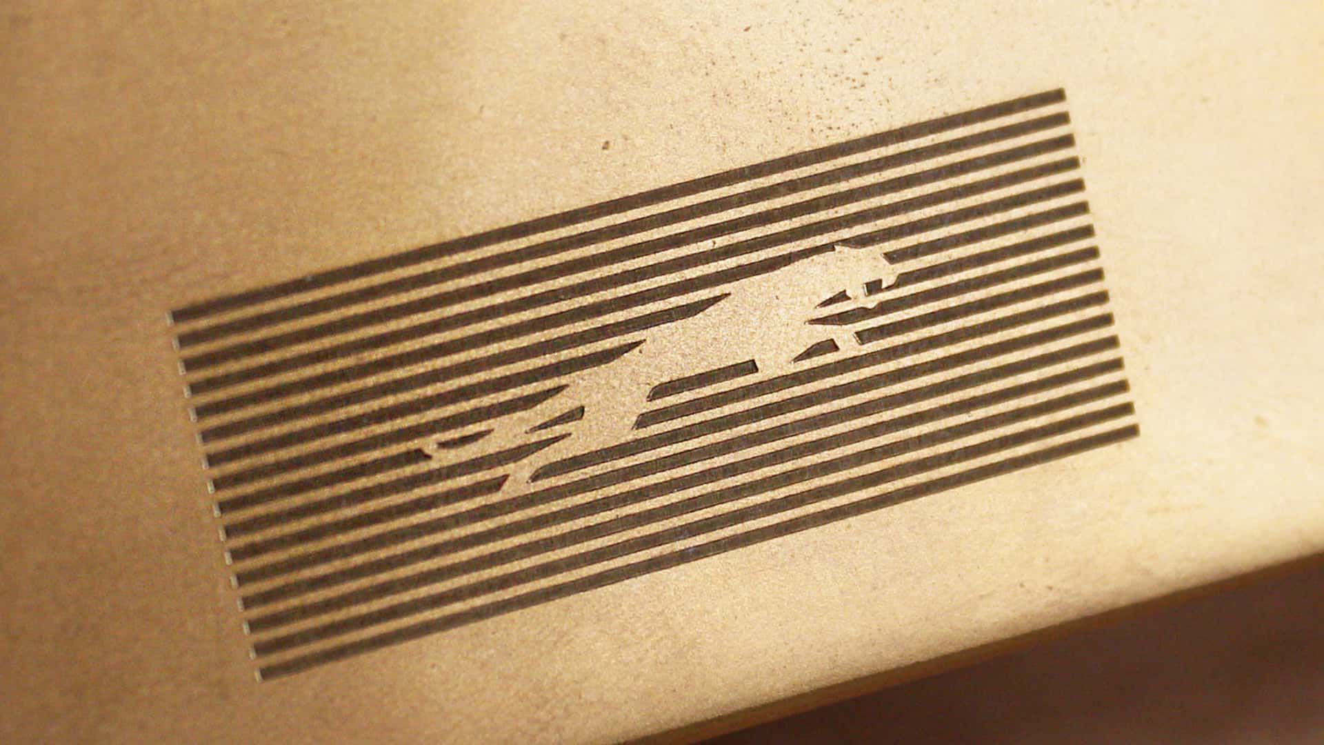
J a G U a r is just their new typeface (I think that’s the name?); and apparently/allegedly is to make the pronunciation closer to UK English, rather than American.
Either way, though - it’s still…
/j
…pReTtY fArKiN’ sToOoPiD.
typeface (I think that’s the name?);
Logotype.
I would have guessed that was a Puma logo.
Slazenger
You’re making that up.
You spell stoopid with three O"s. Maybe your the stoopid,
Yeah that’s pretty dummb
Awh hell nah, no more JAAAAAAAAAAG :(
The font is ugly.
Jaguaren’t
JaGUar

I hate these new logos these corporations make, the old jaguar logo looked like power the new one looks like some weird startup.
You’re all making fun of it but this new style did exactly what it intended to do. Everyone is talking about them now.
Yeah, for a whole 2 hours, until everyone moves on to bitch about the next thing and then Jaguar are stuck with the shitty new logo no-one recognises for long after that.
Why would no one recognize it? Hardly the first time they’ve changed their logo.
But it’s the first time they’ve made a change as drastic as this. I can recognise any Jaguar car out there even if I know fuck all about their cars because I can see the jaguar design on the car.
Now people will have to squint to make out the word JAGUAR in that shitty font? Bad move.
It’s not the first time they’ve made a “drastic” change.
As a matter of. They’ve had a logo similar to this before in the 50’s. With just the word “Jaguar”.
You have the world’s combined knowledge at your fingertips. And you choose to be ignorant and blur out something so stupid as “But it’s the first time they’ve made a change as drastic as this.”
If only they sold stuff that the people talking about it could afford in the first place, maybe that’d boost their sales.
First step is increasing brand recognition. No one will buy if they don’t know you exist.
A brand that has been known for nothing but luxury sports cars for decades, including by people who don’t even follow car culture, is hardly one that would need to increase brand recognition. I’d expect that from a new company, not one with nearly 80 years operating under the same name
Did you know. That every single year. Millions of people are born that has never heard of Jaguar. Because why would they?
Last time I ever heard someone talk about Jaguar was 20 years ago when they sold their f1 team.
Prior to that. I have not given them as much as a single thought. So yes. Them changing their logo certainly did what it was supposed to do. Get people to talk about Jaguar.
Their logo doesn’t have a jaguar and their car commercial doesn’t have any cars. Fuck it, whatever
