

And no, I will not tell you what my company app is.
You must log in or register to comment.
Gave me flashbacks to my time working with Philips’ Tasy system in 2017.
By now they must have finished implementing their HTML5 system which was somewhat better, but back then it was still a desktop app made almost entirely using Delphi and was basically as unsightly and unwieldy as the example in the meme lol
You forgot the ads on google
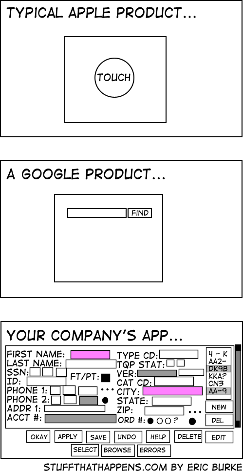
more checkboxes == more better

hey this thing was great back in the day
Those are radio buttons, tho. But nice work with fieldsets 👍
I actually kinda like that one.
I don’t understand, what did poor codecs and bitrates do wrong to deserve such harsh treatment, viciously denied checkbox privileges forever destined to a pleb drop-down menu :'(
Oh god I know 3rd party encoders like this from from my tape flipping days. They’re some sort of dark sorcery you never question. Just press “will try to play or encode” and then make the appropriate sacrifice at your altar.
I loved making interfaces like that for internal systems in the past. I’d find a way to put everything relevant on the screen and able to be read or interacted with any time it’s necessary. I also had it flow top to bottom and left to right, because there was typically a physical process step associated with that station.
At least it doesn’t have ads
CEO: “Now theres an idea…”
Whoever made this has never used Google Cloud Platform.
This, but trying to slap all of that into a ‚new‘ react app while not hardcoding every damn input.
Ohh its easy. Its sap
I’m not really sure why both first name and city are required but I hate oversimplified mobile designs. Whenever a web page loads everything into a big rounded edge middle column I do a little angry exhale.
I’m an adult with a mouse and keyboard, I don’t need giant baby buttons and you can load more than two rows of something at a time ffs.
Lazy Web devs who took the ‘mobile first’ mantra to mean ‘mobile only’ 🙄
There’s a difference between software that’s designed to be easy for people that haven’t seen it before and software that’s meant to be used by someone that’s been trained to use it.
I think it’s more a case of needing to be idiot proof and provide the correct answer every time. Some people using it may have been trained but they also may be absolutely useless at using technology. Google may be simple but it doesn’t give you exactly what you’re looking for and all the relevant information on the first attempt.
Yes and no. I did build several in-house enterprise applications and for this I know about this problem. And yes you’re right, a lot of the complicated contexts are more complex than searching on Google.
But! Enterprise software architects have a tendency to make every feature as visible, and also making the apps as feature rich as possible. This comes with high costs.
I always try to establish a strive with exactly what google delivers.
Cage the user in his first decision, Filter or action and then show him or her the application with all the features feasible in the chosen context. It is amazing how complexity reduced most of these applications are when you just ask this first question.
Please remind Microsoft of this as they continue to “improve and modernize” windows.
Can’t even use keyboard shortcuts to save a damn picture in paintbrush.
What the heck is paintbrush?
MS Paint
It’s called Paint now. Back in the old days it was called Paintbrush. It’s an anachronism.
FWIW MS has Paint 3D now and will probably have Paint 365 and Paint Series X before we know it.
It was always called Paint. Paintbrush is the Mac equivalent

Hmm so back in Windows 3.1, Wikipedia said paintbrush was a Mac app from the early 90s.
I mean, so many company overload there screens with button. I can understand why Apple and Google keep doing there thing.
I have to disagree. Removing features for the sake of simplifying things for the idiot masses frustrates me like no other. To this day I’m still upset over the removal of the Menu button in Android.
Also, love to be that guy: it’s their. I’ll never understand why people mix up their, there, and they’re so easily. Same goes for you’re and your. I realize that I’m being a dick but this shit is basic elementary school English.
I hope that’s a power user app, right? RIGHT!?!
No it logs the days u showed up so it can deduct from ur salary upon missing 2.3minutes of your shift
The developer who made it was forced to make it in 1 week because the company said it is a simple app and paid less than minimum wage
Also it uses Times New Roman font because companies believe it is the only font in existence and should definitely be used in UI instead of fonts meant for UI like Segoe UI on Windows which has UI in its name
There is a clear difference here: the first software, you pay to use. The last one, you get paid to use it.
100% this. I used to work at a company that sold software that mechanical engineers used all day, every day in a certain field. Our app looked like the last pic but with better alignment.
People who are competent want all the things on their screen all at once all the time. They also want keyboard shortcuts.
I think there’s a balance and I would say it looks like autocad. It can be annoying to use but holy hell when you know what you’re doing. Low floor, high ceiling, and rarely gets in your way
An automation API would also be nice please… (i hope it doesn’t require an additional $4000/y licence)
Good.
You need all that information, but no more. This allows me to efficiently supply it, properly formatted, and to supply no more. Assuming this is using standard widgets instead of reinvented ones, the only better thing would be an API so we can roll our own form or automate.
The FAANG approach relies on an army of people to do the data entry equivalent of mind reading, or invasiveness, or both, and all so that you have to look at a few less boxes for a minute.
The honestly prefer the bottom one than the modern 50 step wizards that take 10 seconds for each page to load, and load an ungodly amount of JS scripts.
A company I worked for was using an ancient bug tracking tool (called Pivotal) that looked like a 90s site. It was so fast and responsive. Later, we moved to something modern. It was 10 times worse, significantly slower and overly complex.
I hate when websites don’t have the username and password together. When you have to put in the username click ok then have some JavaScript hide the username prompt and prompt you for your password. Makes it more painful when trying to use a password manager. Especially one that isn’t built into the web browser by default.
It’s called home realm discovery. It’s common in business apps though it’s usually used with email & password logins not username & password logins.
It’s done that way to support federated logins. Larger companies will often used a single sign on solution like Okta or Azure AD. Once the user’s email address is entered it checks the domain against a list of sign on providers for each domain and redirects the user to their company’s federated login if it finds it there instead of prompting for a password.
This has several benefits:
-
The user doesn’t have mutiple passwords to remember for different apps. Which is know to result in users either reusing passwords or writing down passwords somewhere.
-
When an employee quits or is terminated the company only needs to disable their account in their company directory and not go into potential dozens of separate web apps to disable accounts.
-
The software vendor never receives the password, if the vendor’s system is compromised they don’t even have password hashes to leak. (Let alone plain text or reversibly encrypted passwords)
Websites that work that way are (usually) doing it right. If that doesn’t work with your password manager, you should (probably) blame the password manager not the website.
I doubt the password manager is blame that there is now two steps to logging in compared to the previous one. The password manager still works, just requires using it twice. An annoyance because it used to be a little bit easier.
Thanks for all the info on home realm discovery. I love to learn new things!
If a website using home realm discovery adds anything more than one extra press of the enter key or mouse click of an ‘ok’ button, get a better password manager.
If you’re annoyed by that one extra click that’s fair. Click counts matter.
-
I agree that is an awful way to do things, but Bitwarden doesn’t seem to have a problem entering the username on one page and the password on another.
Yeah, Bitwardem is what I use. Just my little complaint about them doubling the steps to log in.
KeePass autotype is amazing for these situations. Very customizable.
Not really relatable, but if i file something complicated i prefer seing all options to fill in the blanks if i’m not too sure if it’s the correct information for the question.
So i rule out some and find the best fits until hopefully most if not all is correct, getting asked one at a time means i have to get it right and if some better fit comes later i have to go back many steps.
Agreed. Everything on 1 page, submit, done. I had to use Workday at my last job and it was fucking atrocious trying to get anything submitted in because it was all step by step bullshit.
Fucking almost all of my jobs have used Workday. If so many companies are using it you’d think someone would have realized by now how awful it is.
Yea, it is one of the worst things I’ve ever had to use and I had to use it a lot. It wasn’t even supported by our IT team. Somehow HR went around them to implement it themselves. Which made it even worse because there were a shitload of problems at the start that any tier 1 help desk agent could have told them would happen if they’d bothered to ask for help.
I’m sure if this weren’t black and white it’d be some green on black z/OS goodness.


